UX/UI Design Case Study: Text / Message Aggregator App Concept
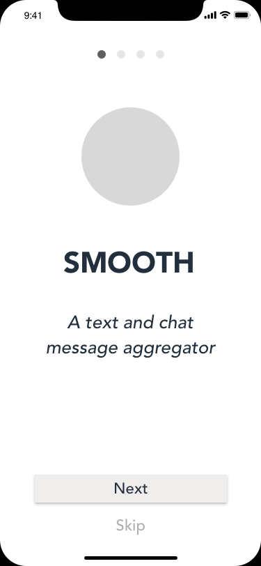
SMOOTH , An App for Aggregating Your Text and Chat Messages
Project Concept
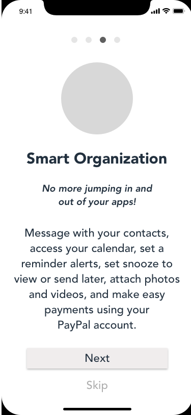
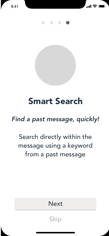
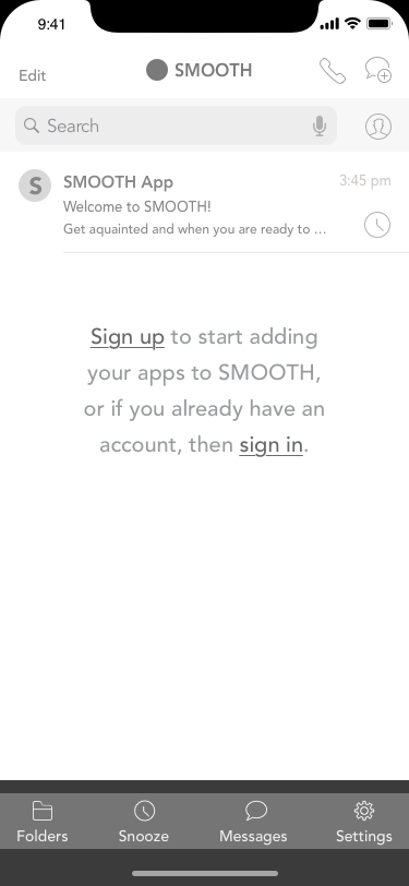
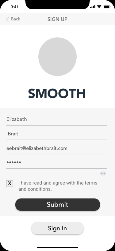
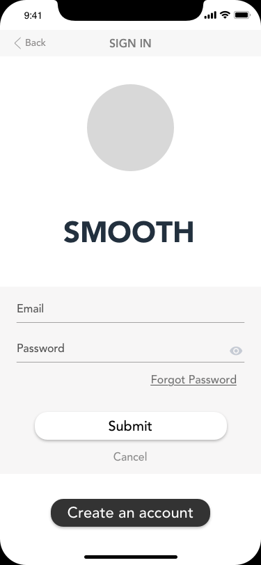
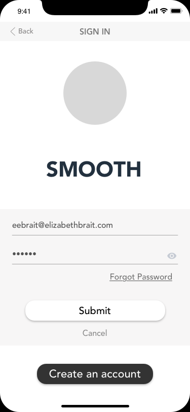
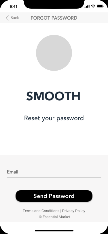
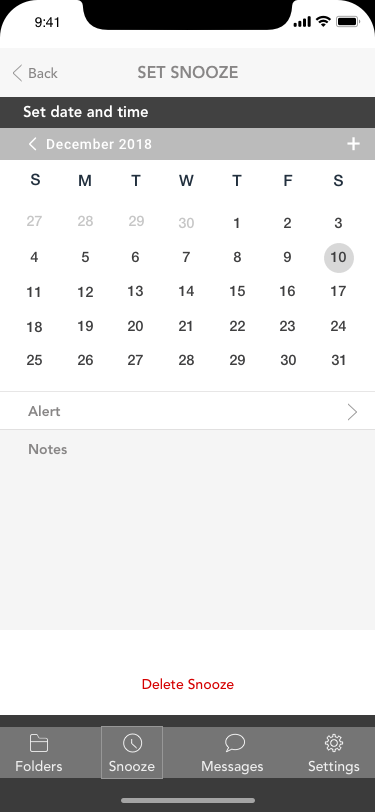
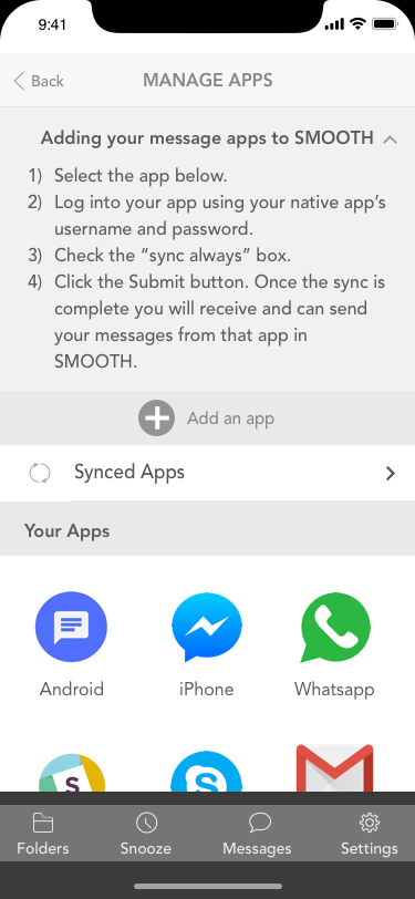
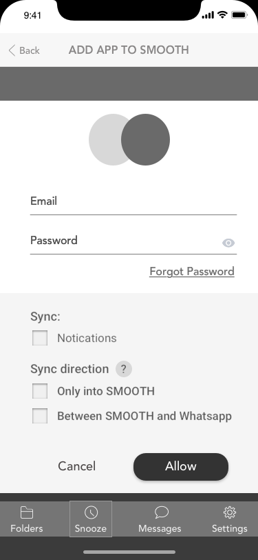
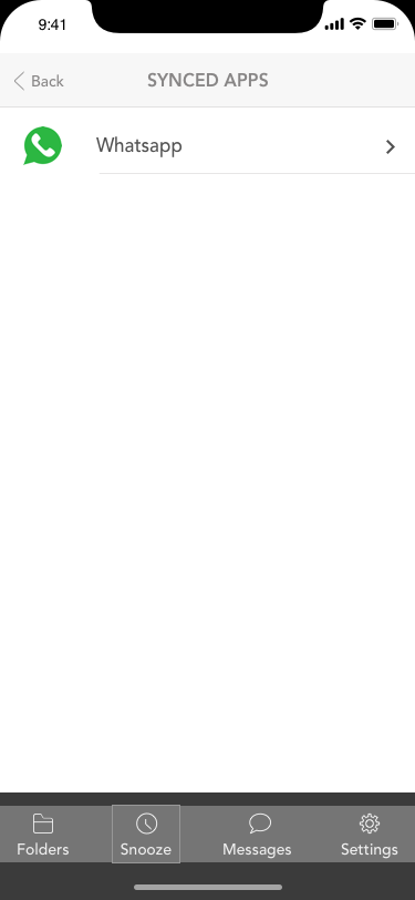
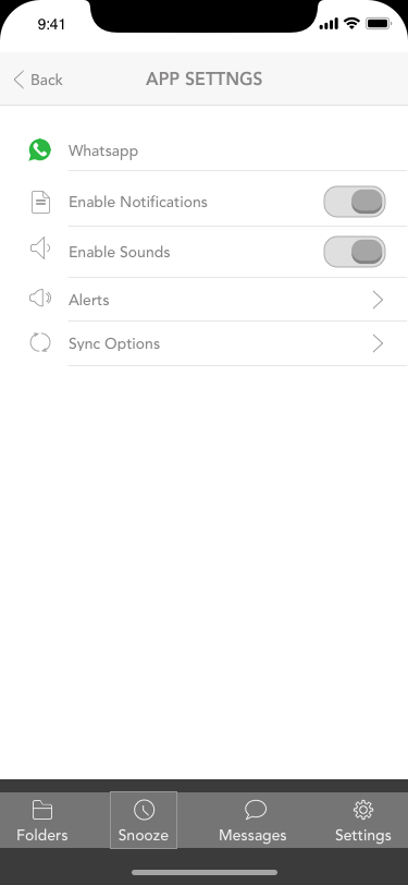
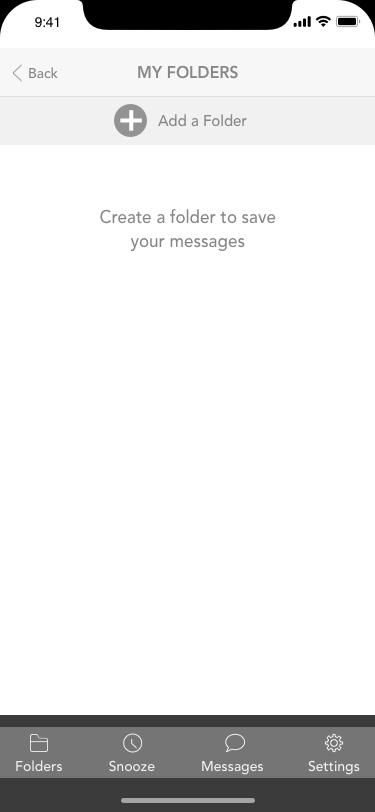
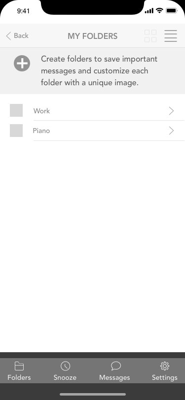
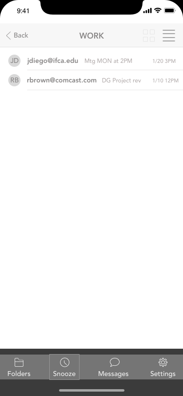
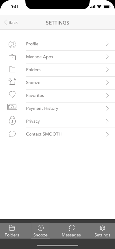
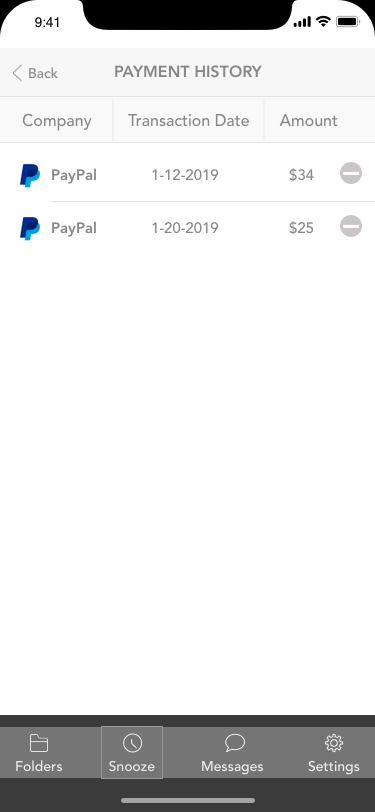
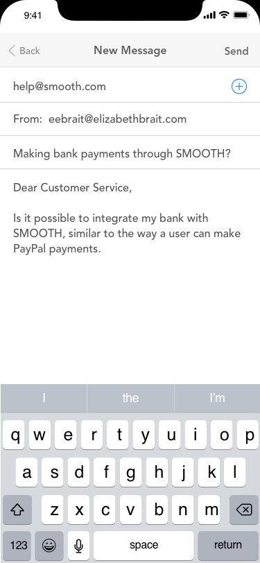
To design an app, which aggregates text and chat messages from multiple apps into one location. The concept for this app would allow the user within the app to connect to their other text message/chat apps, calendar, and bank account.The user could save messages in folders similar to email in two different formats (visual or text), and messages could be "snoozed" allowing the message to populate at a later chosen date. In addition to other features not mentioned.
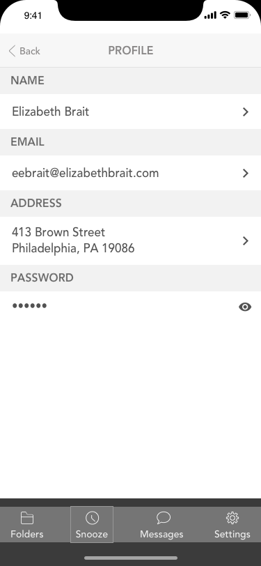
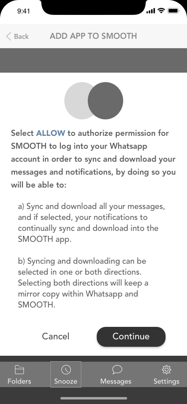
This project was started when there were only a few text aggregators being used. For a variety of reasons this project was never completed. However, what is important to recognize is that a good amount of concept and product development and research was executed to create these low-fidelity screens. Five plus competitor apps were evaluated and additional features (not seen in these screens) have been considered. One of the survey questions asked about security and passwords, as a result of user feedback this product was designed to use oath technology. Allowing the user to use another apps' username/password, which would allow the two apps to sync and stay up to date.
The concept of this app might be ideal for a company that wants an internal messaging system for their employees only. Such as, the sale team.
If you find this project interesting and would like to discuss further, consider scheduling a meeting.
User Stories and User Flows
A User Flow Example:
User story: As a user...
Task: I want to sign up for Essential market.
Purpose: To buy groceries with an app.
Go to page: Sign up and create an account
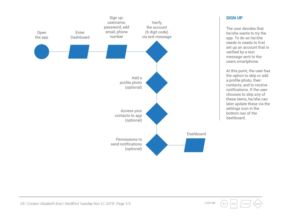
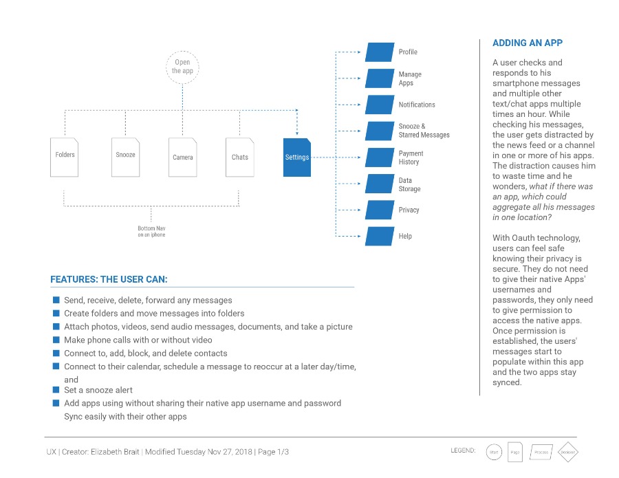
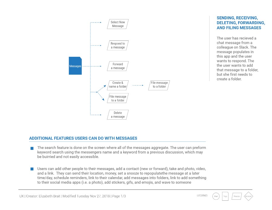
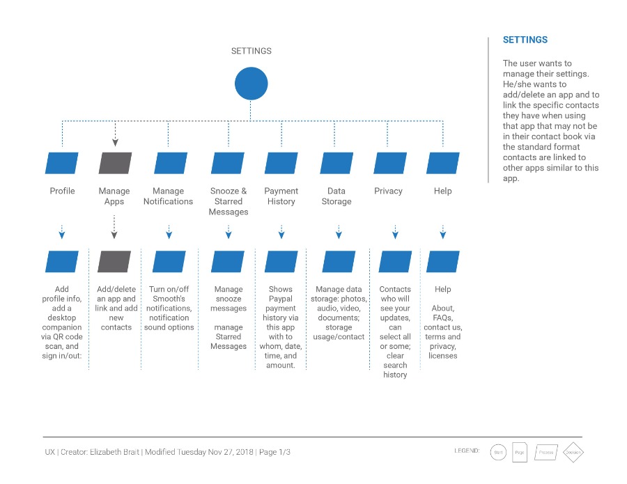
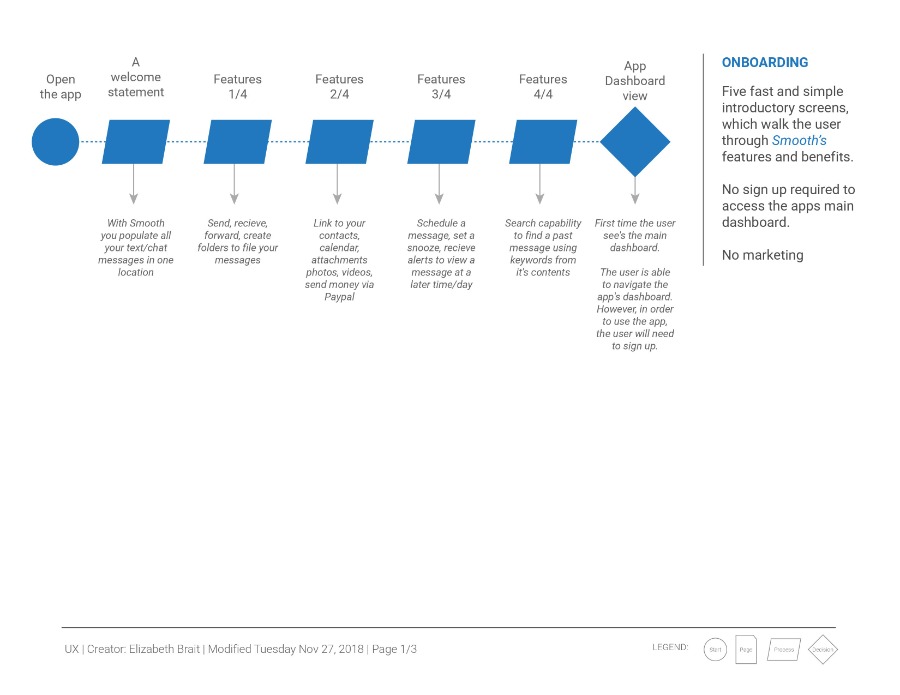
User stories and user flows (below) were created to describe the user's actions and how a user would navigate the app.
The user flows (below) show how the user navigates from one point to another to accomplish various tasks. These user flows quickly became out of date as the project developed. Initially the grocery store was much larger and not specifically a vegan grocery story. Through many iterations and for learning purposes, I decided to simplify the concept in order to execute a project design, since this was a learning project and not for a "real client."
Preference Test PDF Report
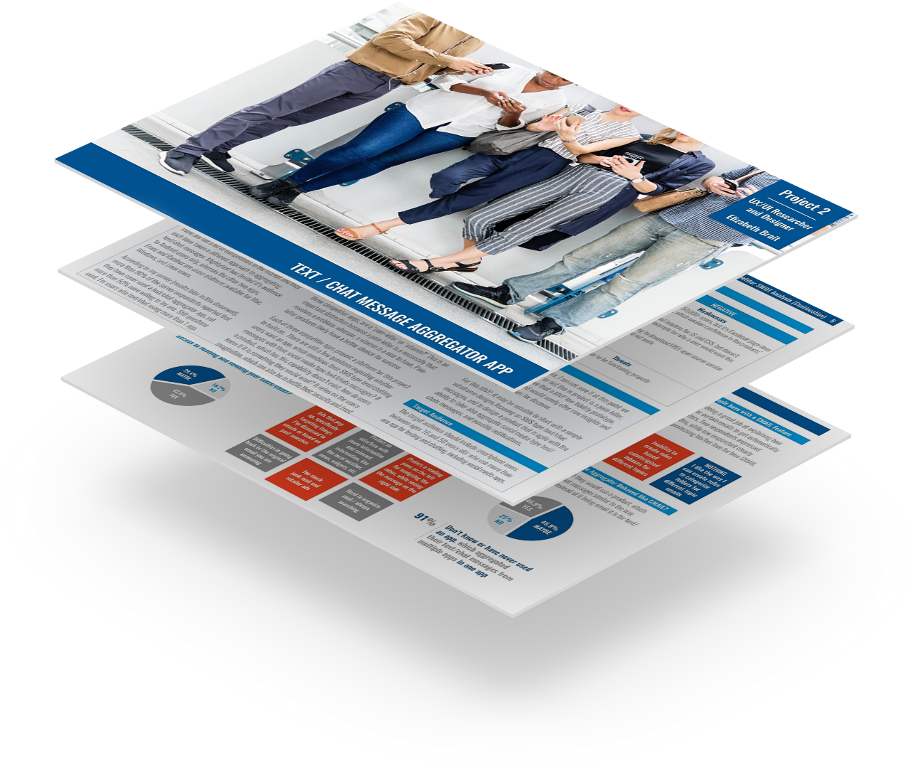
A few key screens were uploaded into Usability Hub in order to collect user feedback. The received feedback helped to finalize these screen designs, each of which went through additional iterations based on the feedback provided, which was invaluable. A report was written about this process (see the link below).
BRAIT Studio, LLC
Our expertise is in organizing information, designing impactful visual storytelling, and transforming complex data into usable and understandable systems and designs.
BRAIT Studio, LLC
Greater Philadelphia, PA
1-610-551-2179
Questions about a project or a job? Let's chat!
